Blog 2 | Weeks 2-4 | Data Warehouse Design
Introduction
This blog covers topics discussed during weeks two through four, which all relate to data warehouse design. Below is a list of each topic and summaries of my understanding for each. Any related materials and readings will be included in each section as well as my thoughts on how they relate to lectures. Data Warehouse Design Cycle. In a nutshell, this is about how data from OLTP (or several transactional sources) is grabbed and processed for the the OLAP, with lots of ETLs in between. Both the OLTP and the OLAP have important roles in the data warehouse ecosystem--the OLTP is record-oriented while OLAP has aggregated type of queries. Kimball breaks down the cycle to four components and refers to it as the DW/BI Architecture. In addition to the OLTP (Kimball calls these source systems), the other components are the ETL systems, data presentation areas, and BI applications. The first step in designing a DW/BI is to consider the needs of the business.
Balance Scorecard (BSC) is a framework for critical management processes: departmental (or individual) goal setting, business planning, capital allocations, strategic initiatives, and feedback and learning. The BSC is the reason why organizations are expanding bottom-line objectives to include success measures in other areas. Tarver from Investopedia, summarizes nicely how businesses use BSCs. The measures are designed to influence all employees toward the overall company vision, and having a BSC could measure the performance of data warehouse operations.
Designing a Star Schema was the analytical part of of this module. This is where we begin to see what the data looks like from transactional systems and how they should be transformed for the OLAP so that aggregated data can be displayed to answer key questions. The assignment of designing a Star Schema is when we start understanding the concepts of dimensional data vs. facts and the granularity of events. What really helped me was seeing a map of surrogate keys to facts, which, I posted on Facebook. Then, when we plugged in raw data into Tableau, we can actually see the relationship between facts (measures) and dimensions. Also in Tableau when we create calculated fields (e.g. counting how many planes got damaged) we are able to see how aggregated values are assigned to the measures (facts) sections. Seeing it in action with a real application helped me make sense of the Star Schema design.
Data Quality Analysis is to conduct data profiling and cleansing techniques. When taking data from an OLTP, we need to understand what we're working with and assess its content, structure, and quality. With the Bird Strike data, over 60% of the attributes had missing fields. When publishing in Tableau, I learned that I didn't use 30 attributes because I quickly scanned the data and didn't think ones with significant null values would provide an honest picture of Bird Strikes (except for human fatalities, which is significant even with 1% completeness). Lucky for us, we only had one worksheet, and for future projects involving big data, there are tools to help us assess for quality for optimum and streamlined ETL processes.
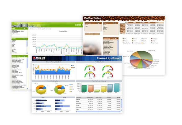
Dashboard Design and Analysis was the best part of this module for two reasons: 1) It ties to all the other topics from OLTP to OLAP, and 2) it was quite fun to design a dashboard. The most difficult part was putting all the widgets onto the dashboard. It gets cluttered relatively fast and you run out of screen space. The article that I posted this week in Facebook is about dashboard misconceptions, and the just-in-time views, if not thoughtfully designed with business objectives in mind, can lead to terrible decision-making.

To: Hans Rosling, you incredible myth-busting, story-telling genius. Thank you for breathing life into data. May you RIP.
>^..^<
Resources:
Kimball, R. and Ross, M. (2013) The Data Warehouse Toolkit: The Complete Guide to Dimensional Modeling. 3rd Edition, John Wiley & Sons, Inc., Indianapolis.
Ram, S. Class Notes, Lectures 3-8, MIS 587 Business Intelligence
Shapiro J. (2017), 3 Ways Data Dashboards Can Mislead You. Harvard Business Review. Available at: https://hbr.org/2017/01/3-ways-data-dashboards-can-mislead-you
Staff (2021). What is a Star Schema and How Does it Work. Tech Target Network. Available at:
https://www.techtarget.com/searchdatamanagement/definition/star-schema
Tarver, E. (2022). Scorecard (BSC), How Is It Used in Business? Investopedia. Available at: https://www.investopedia.com/terms/b/balancedscorecard.asp
Dashboard Image is free stock photo from Creative Commons.


Hello, These following four courses have also been incredibly enjoyable for me, but the dashboard design module has been my favorite. I'm working on assignment two right now and I'm really liking it. I can see how effective it can be when dealing with a lot of data. Which of the modules you mentioned, you liked the most?
ReplyDeleteI too liked designing the dashboard. It was a way to be creative. Thanks for commenting!
DeleteI also enjoyed “Dashboard design and Analytics topic" and I agree with your statement that most difficult part was putting all widgets onto the dashboard. I had many challenges while building dashbaord. However, Tableau tool is one of the simple and easy tools to create interactive dashboard. Tool has many variations and filter options. Data Visualizations tool can create easily and complex things can be present in a simple manner.
ReplyDeleteGreat summary. As far as the data quality with the bird strike NULL values, I attribute those to pilot hesitancy to spend 20-30 extra minutes post-flight filling out bird strike reports after a long day of flying haha...especially if the strike had little impact to the flight.
ReplyDeleteThank you for your concise synopsis of the relevant modules, I agree that the dashboard was the most fulfilling aspect of the module and it certainly was a fun exercise. I never thought I would become a bird strike expert as an outcome of this course but it certainly demonstrated the power of leveraging data sets to make informed decisions.
ReplyDeleteWe are all bird strike experts now, and I couldn't help but share my knowledge with my colleague just before she hopped on a plane. lol.
DeleteHello Kat, thank you for your review of Data Warehouse Design and more! I enjoyed your describing your experience with the Bird Strikes worksheet. There were definitely a lot of attributes with null values. And, initially, it was hard to decide which attributes are the most necessary because of the missing or badly formatted data. I wish we provided a data profiling tool to help. What was your technique or ideas for fixing data issues during the assignment? I went through each column, one by one, and fixed the values which seems archaic given the resources available.
ReplyDeleteHi Loren, Thanks for reading! I used the ZN function in Tableau to change null values to zeros when I needed to count stuff. I also changed the Boolean values in Tableau to more meaningful names. This was my first time using Tableau, so I read A LOT of tutorials and Googled stuff like "how do I change null values in Tableau" or "How to change True False in Tableau." This is my method for everything. :-)
Delete